

CLIENT:
HU
YEAR:
2024
ROLE:
PRODUCT DESIGNER

Story.
When I first moved abroad for my master’s, I learned something quickly: money was always on students’ minds. Rent deadlines, unexpected fees, groceries that suddenly cost more than you thought, it was like walking on a tightrope every month.
One student told me in an interview:
“Every month I cross my fingers I won’t miss rent. I don’t want to check my balance because I’m scared of what I’ll see.”
That sentence stuck with me. These weren’t just numbers on a screen, these were students’ lives, stress, and safety nets.
That’s where the idea for X Bank was born. Not just another finance app, but a financial companion that feels supportive, proactive, and human.
Business Problem.

International students don’t just need an expense tracker. They need:
A way to automate boring tasks like categorizing transactions.
A dashboard that makes sense instantly, instead of throwing walls of numbers.
A chatbot that talks like a friend, offering nudges, reminders, and encouragement.
Tools for rent, tuition, and savings that match their real lives.
And they need it all without feeling like they’re failing every time they open the app.
Research.

We spoke to 7 international students, ran surveys, and studied apps like Cleo, Dyme, YNAB, and Revolut.
What we learned:
Students hated manual tracking. “I always forget,” one said.
They described finance in emotional words: fear, stress, surprise.
They wanted more personalization: “Tell me when rent is due. Tell me if I’m overspending on food.”
This told us something important: finance design is emotional design.

Our First Ideas (and First Mistakes)
We sketched three possible directions:
A dashboard full of tables and lists.
A gamified tracker with progress bars.
A chatbot-only app.
Students loved parts of each but rejected them as stand-alone concepts. “I want numbers, but not only numbers,” one told us.
So we merged them: a personalized dashboard + a supportive chatbot.
Our first wireframes grouped expenses by “source” (e.g., debit card vs. scholarship). It made sense to us, but in testing, students said: “No, I think in categories; groceries, housing, transport.” That mistake taught us to drop cleverness for familiarity.
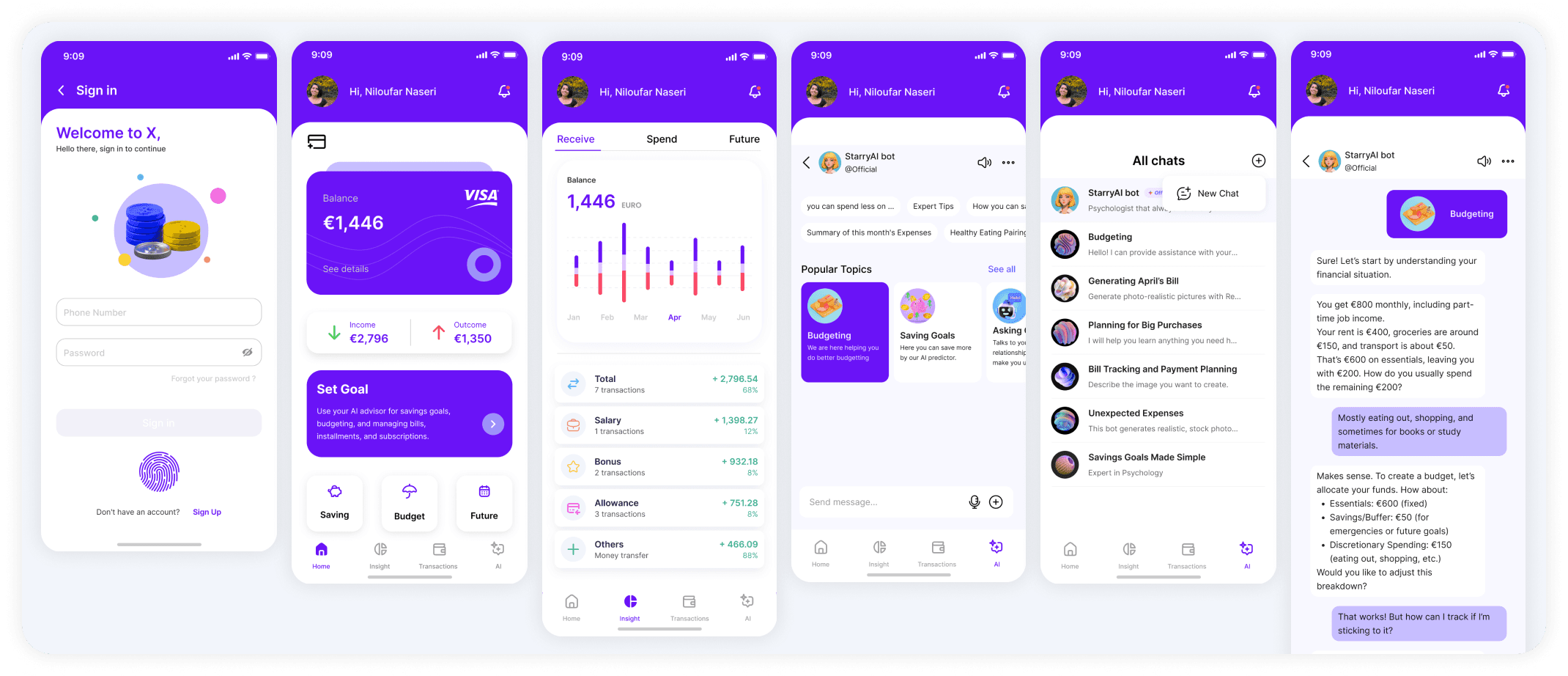
Prototyping: From Clutter to Clarity
Our first prototype looked like a bank app, full of text, tables, and tabs. Students hated it. “It feels like homework,” one laughed.
We redesigned:
A card-based dashboard with spending insights front and center.
Icons and graphs instead of text walls.
A “Future” tab turned into a progress tracker for subscriptions and rent deadlines.
A chatbot with quick-reply buttons (“Budgeting,” “Saving Goals”) and voice input.
The Breakthrough
The turning point was a single comment during testing:
“I don’t want an app that just shows me numbers. I want it to talk to me like a person.”

Service Blueprint.
How X Bank, the AI assistant, and the real world work together so students feel in control, not confused.
I wanted to make sure the experience felt simple on the surface, yet solid underneath. So I mapped the journey from the moment a student opens the app to the moment they receive a monthly summary. The goal was to align what the student sees with everything that happens behind the scenes, so nothing feels like magic. It feels trustworthy.
“I just want to open the app and know if I am safe this month.”
That sentence became the north star for this flow.


Accessibility wasn't an afterthought. It was built in from the start, using A11Y Project's checklist:
High contrast dashboards for color-blind users.
Scalable typography that adapts to different needs.
Voice input in the chatbot for students who prefer speaking over typing.Error prevention with "undo" for accidental deletions.
What's next: testing with screen readers, ensuring tab order for keyboard navigation, and exploring dyslexia-friendly font toggles.
Accessibility isn't a bonus; in the EU, it's the law. More importantly, it's just good design.