

CLIENT:
TAPSI
YEAR:
2022 - 2024
ROLE:
PRODUCT DESIGNER

Story.

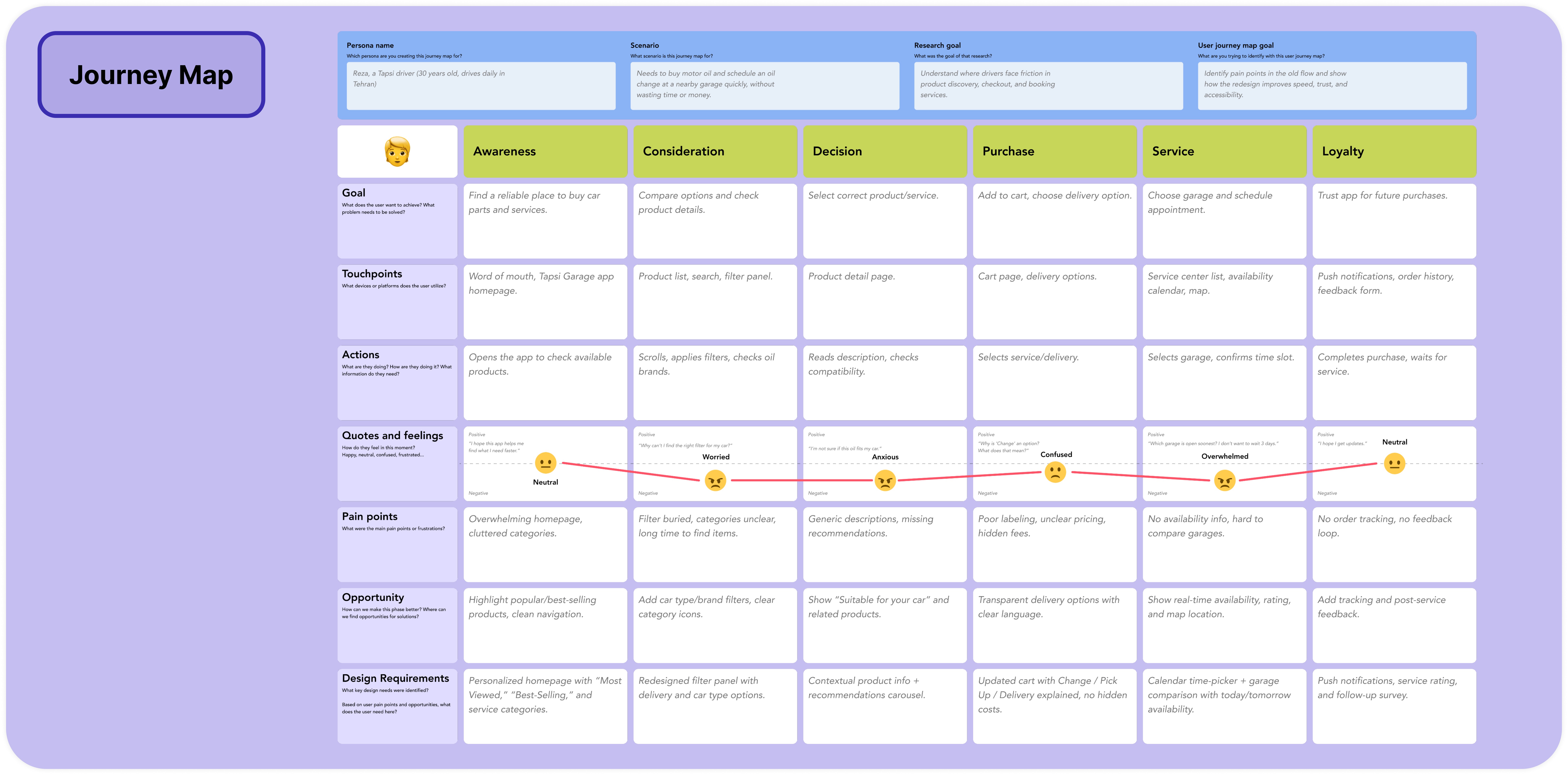
Research.
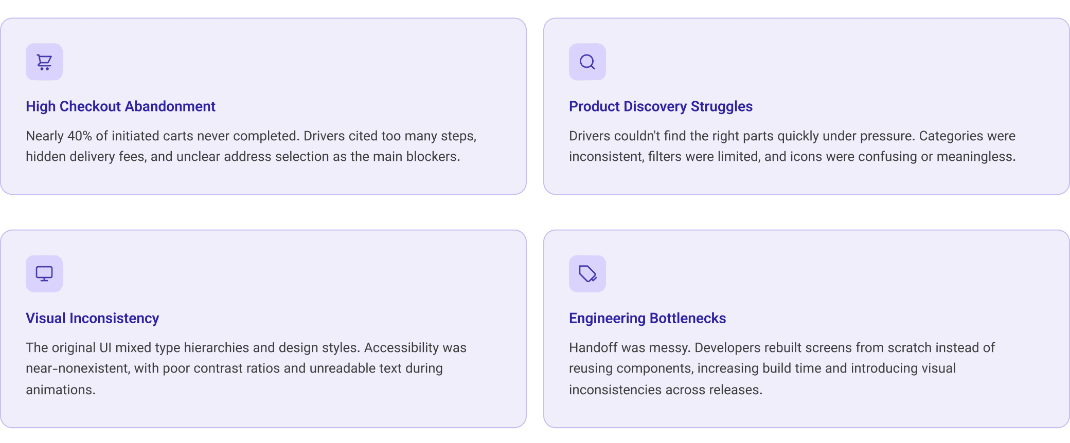
We began by understanding what wasn’t working. Through user interviews, in-app analytics, and heuristic evaluation, we uncovered several pain points:
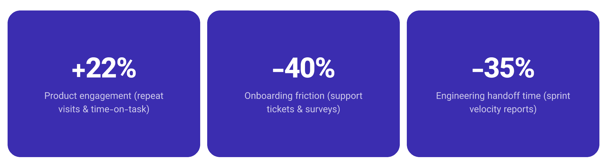
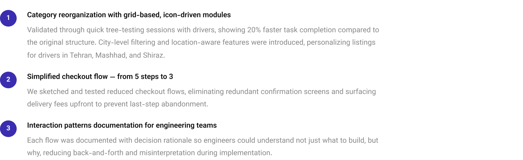
High checkout abandonment: Analytics showed that nearly 40% of initiated carts never completed. Interviews revealed frustration with too many steps, hidden delivery fees, and unclear address selection.
Product discovery struggles: Drivers often couldn’t find the right product quickly, especially under stress. Categories were inconsistent, filters limited, and icons confusing.
Visual inconsistency: The original UI mixed styles, type hierarchies were unclear, and accessibility was almost nonexistent (poor contrast, unreadable text in motion).
Engineering bottlenecks: Handoff was messy. Developers rebuilt screens from scratch instead of reusing components, increasing build time.
This research shaped our problem statement:
How might we create a scalable and accessible product marketplace that makes car maintenance purchases fast, intuitive, and reliable for drivers under pressure?

Information Architecture.
Structuring the experience before building it.
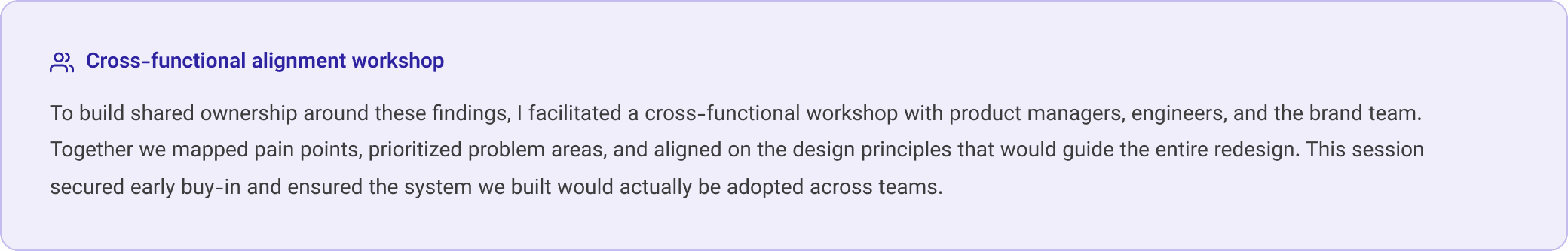
With research insights and workshop outcomes in hand, we moved to restructuring the experience from the ground up. Three key areas drove the IA work.

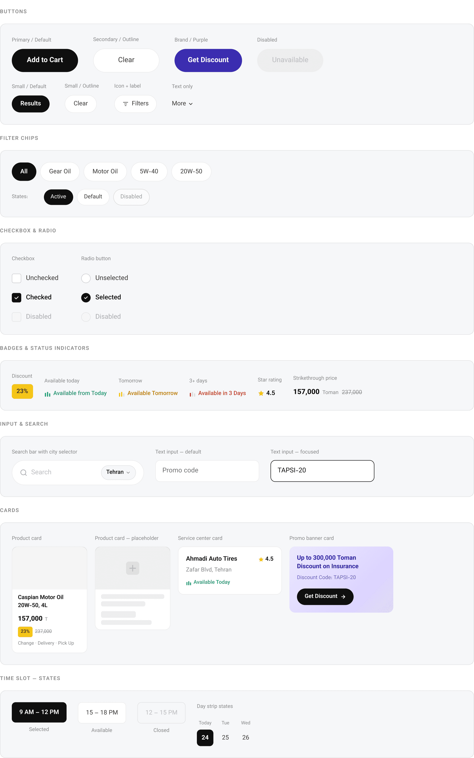
Design System.
Building a scalable, governed component system.
The design system was the backbone of the entire redesign. Every decision, from spacing tokens to governance documentation, was made with future teams in mind, not just the immediate product.
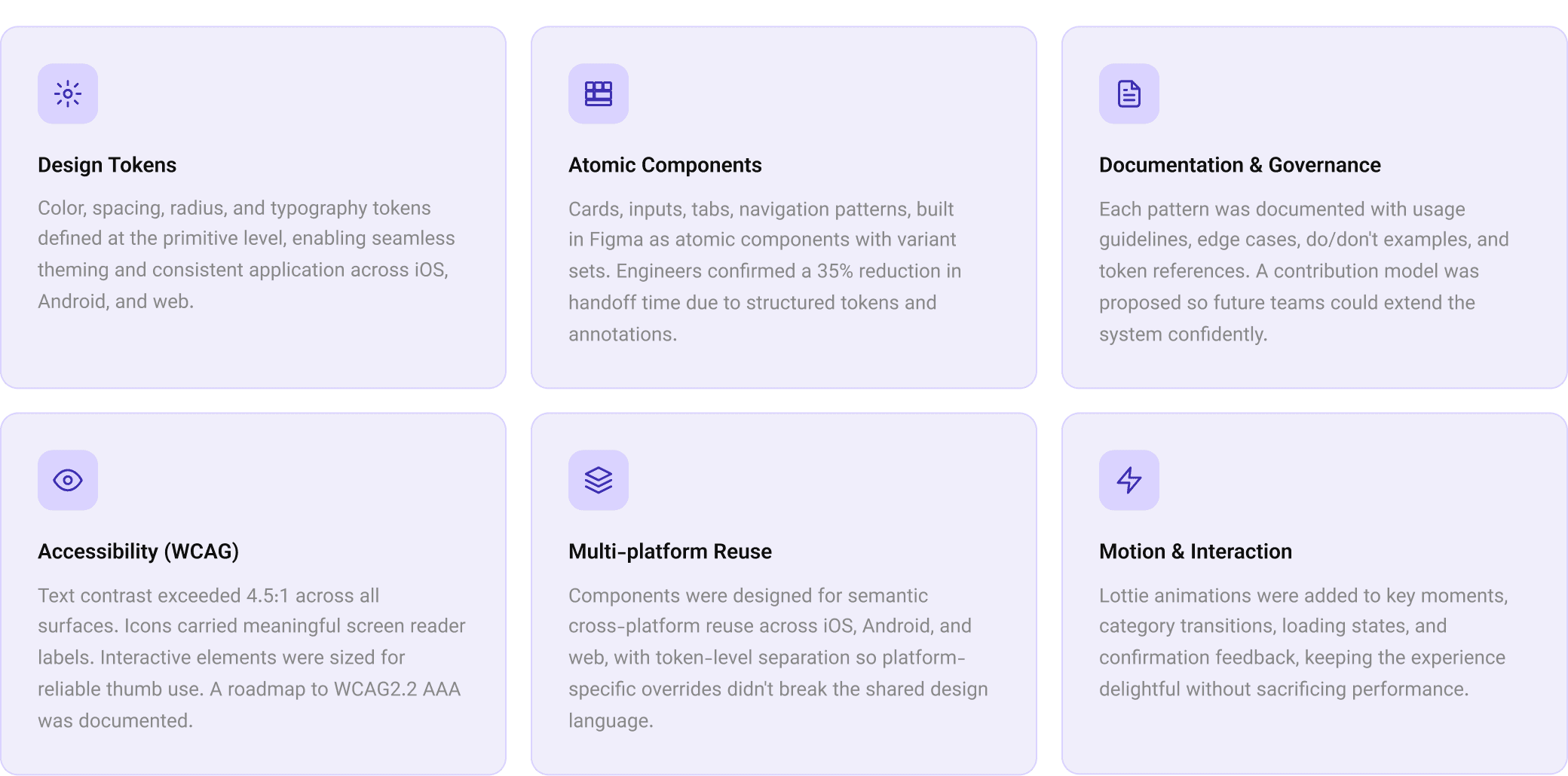
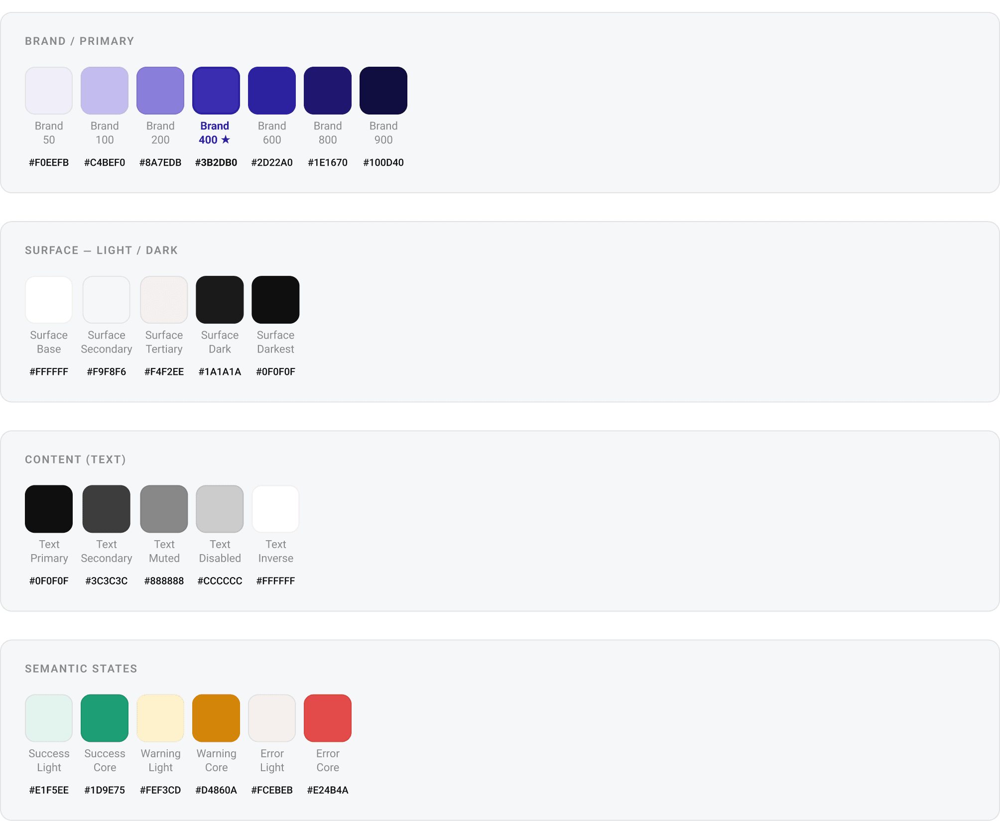
Color tokens
A structured color system with semantic roles, palette primitives mapped to surface, content, border, brand, and gradient tokens. Light and dark mode parity ensured throughout.
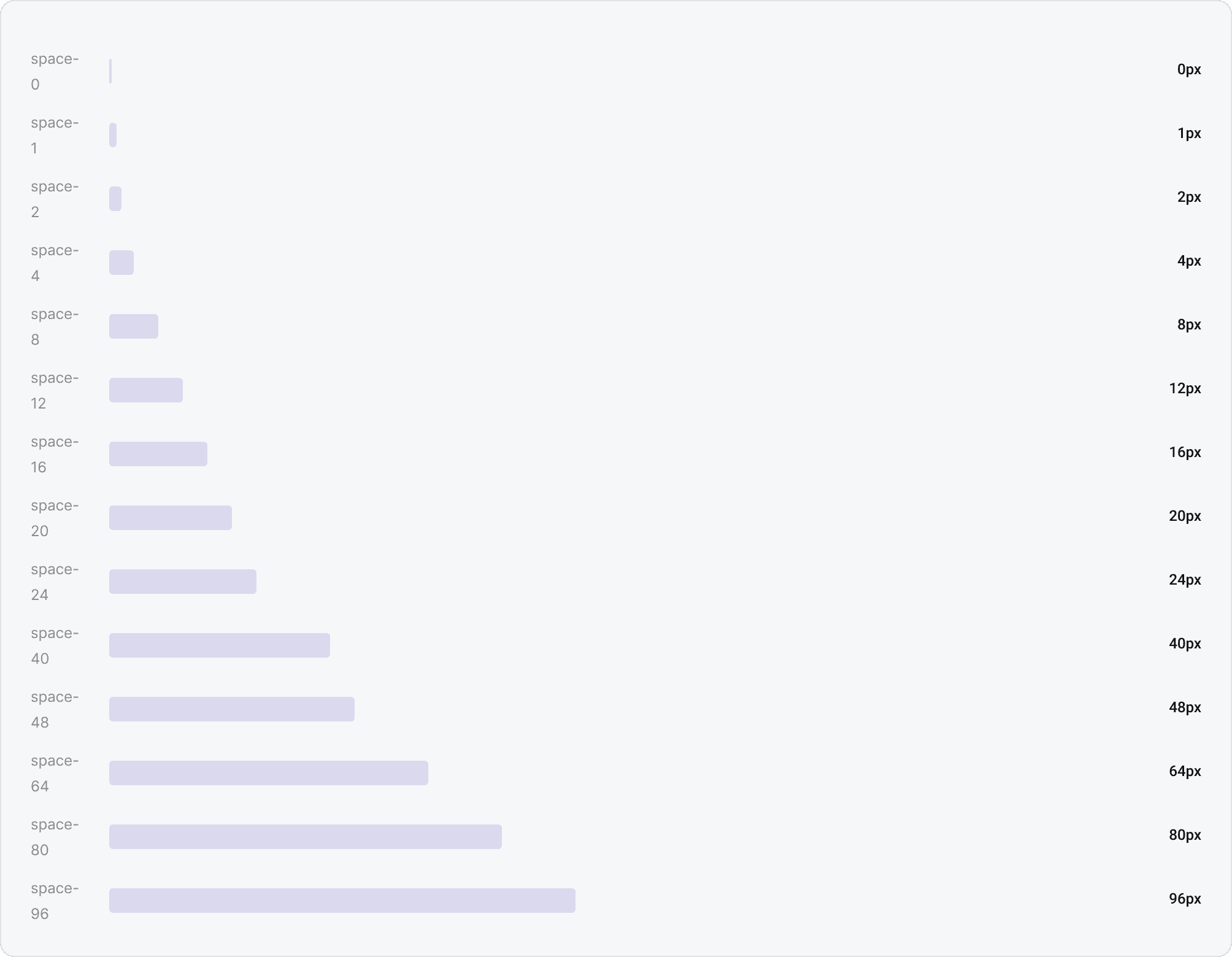
Spacing scale
A base-4 spacing system with 14 steps, providing consistent rhythm from micro padding to page-level layout margins.
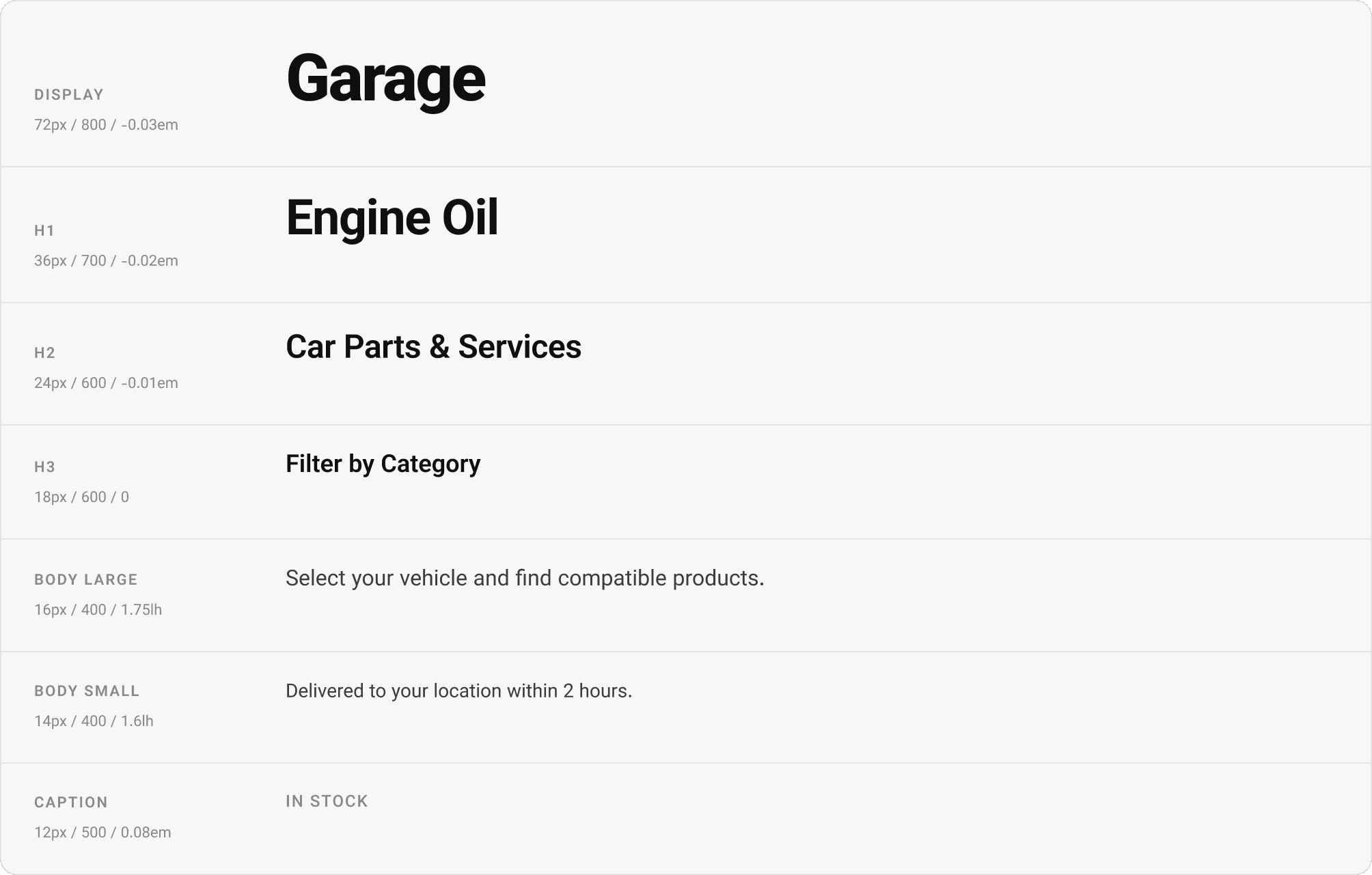
Typography scale — Vazirmatn
A single typeface (Vazirmatn) across all weights, chosen for its dual Persian/Latin support and legibility at small sizes on mobile screens in stressful driving contexts.
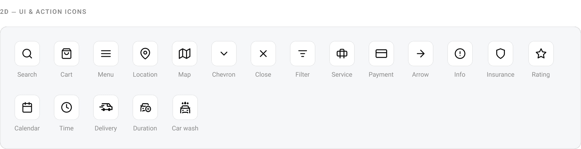
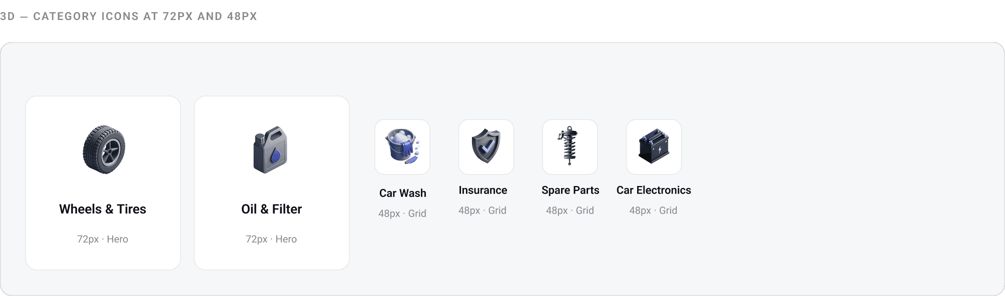
Icon library
Two icon families used across the product: 2D line icons for UI actions and navigation, and 3D rendered icons for category identity. All 2D icons follow a 24px grid with 2px stroke. 3D icons exist at 72px (hero) and 48px (grid).
Component library
Atomic components and patterns. Each is documented in Figma with usage guidelines, token references, and all interactive states.
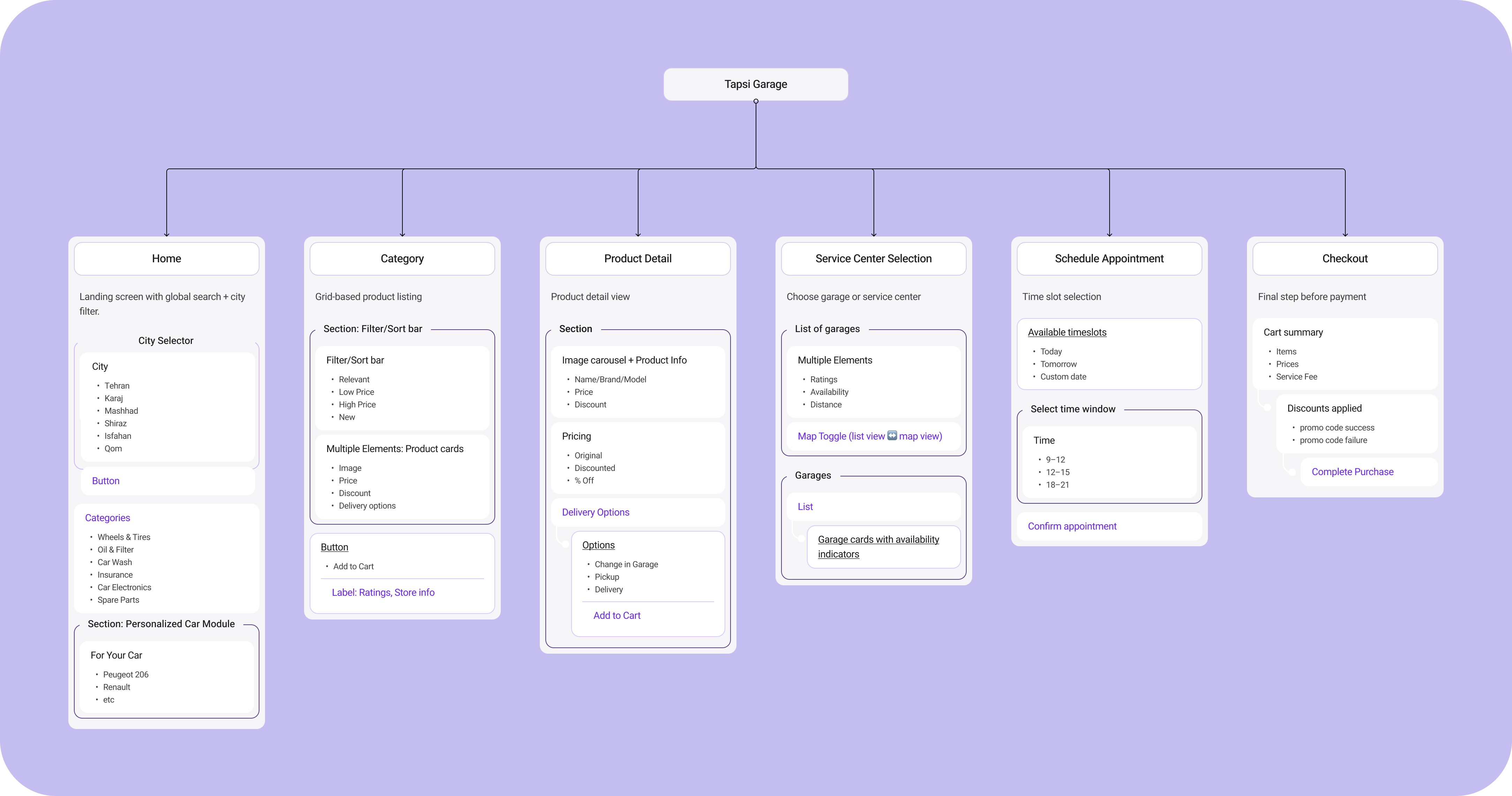
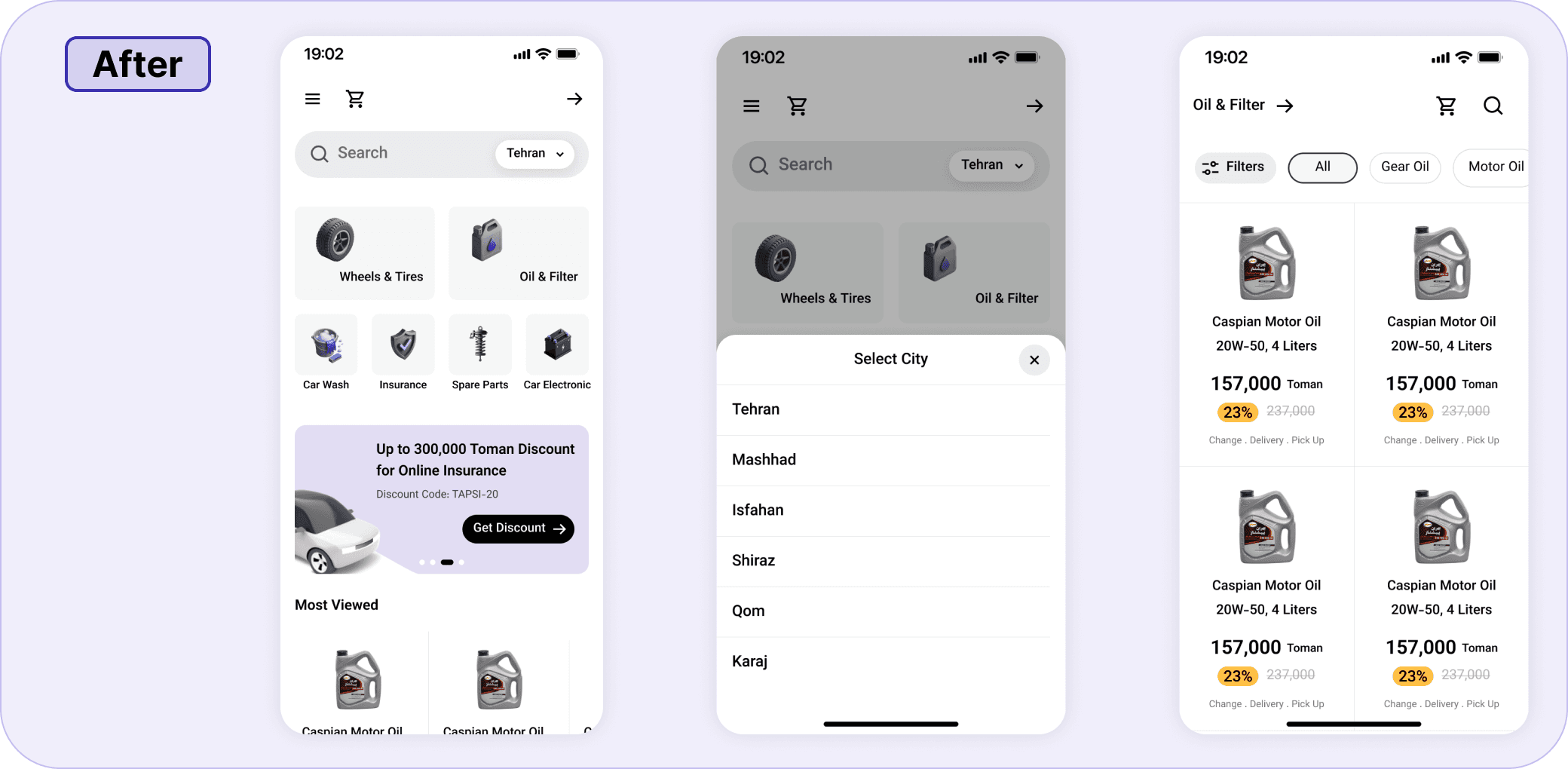
The redesigned experience, in context.
The flows that shaped the redesign: the home screen with grid-based category navigation, the city selector that enabled location-aware product listings, and the product listing page with filters and pricing.


While my direct role ended at launch, I proposed next steps:
Driver feedback loops → in-app surveys and heatmaps to track where users still hesitate.
Dark mode adaptation → critical for night drivers.
Expanding accessibility testing → partner with accessibility consultants for WCAG 2.2 AAA.
AI-driven product recommendations → surface relevant car parts based on driver history.
By leaving a roadmap, I showed both care for the long-term vision and commitment to iteration.