

CLIENT:
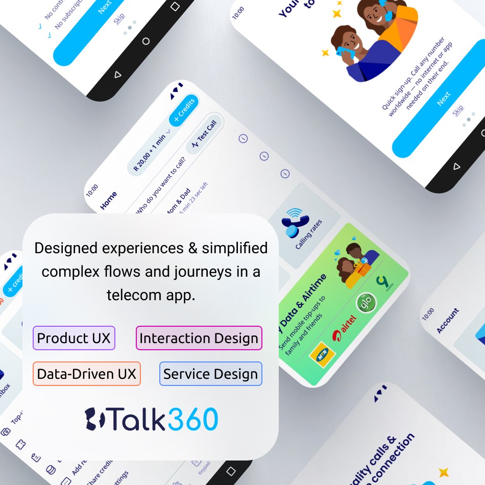
TALK360
YEAR:
2025–2026
ROLE:
PRODUCT DESIGNER
Story.

Business Problem.
A trust problem disguised as a technical problem.
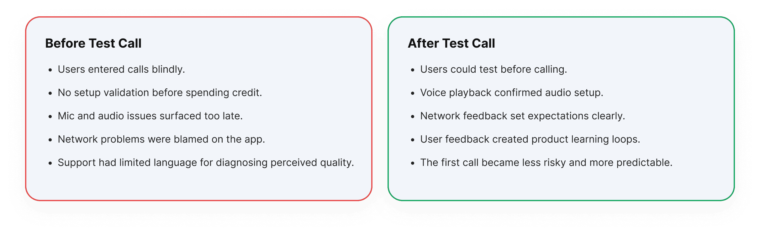
At first glance, the issue looked technical: unstable internet, weak signal quality, inconsistent audio. But underneath it was a deeper product challenge. Users had no visibility into what would happen before calling.
Research.
Understanding the invisible experience.
This project relied on product understanding, behavioral thinking, technical alignment, and iterative collaboration. We focused on what users could realistically understand and what the system could reliably communicate.
Designing within reality

Design Process.
From invisible uncertainty to a clear guided flow.
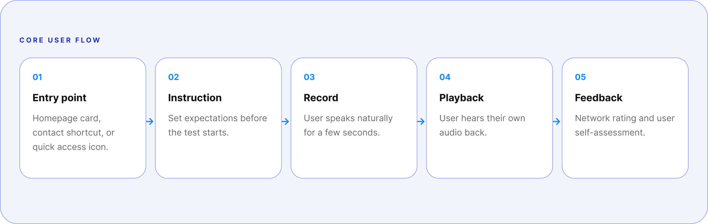
The experience needed to feel like a real call, but safer. Familiar enough to build confidence, guided enough to explain what was happening, and lightweight enough to use more than once.
The emotional journey mattered as much as the functional one.
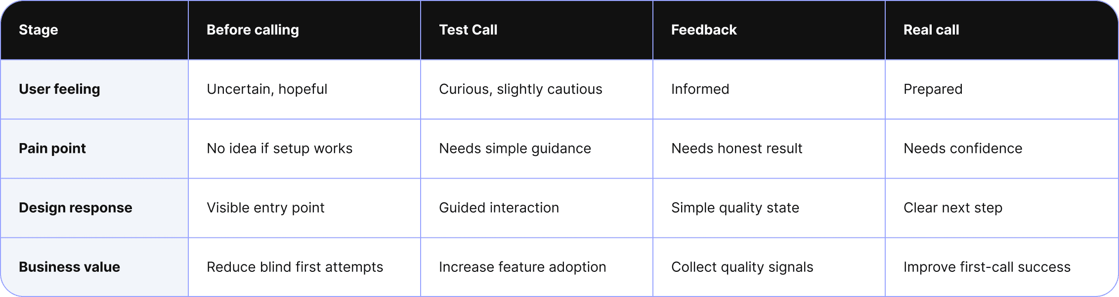
The decisions that were harder than they looked.

From Flow to Interface
The entry-point card needed to feel like an invitation, not a warning. The copy "Check your internet and audio before you spend credit" was benefit-first, not fear-first. The in-call screen mirrors the real Talk360 call UI, building familiarity while adding just enough instructional overlay to guide users through each phase.
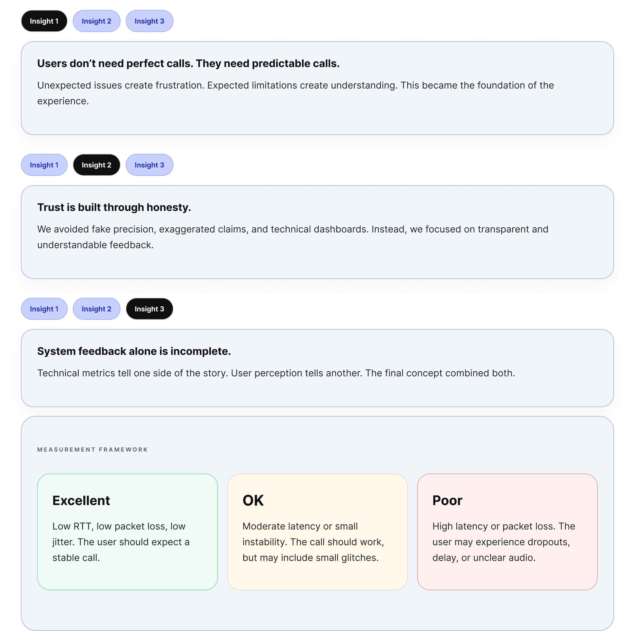
The results screen presented the clearest accessibility challenge. An early version used color alone to communicate quality. That failed WCAG contrast requirements and was invisible to users with color vision deficiencies. The solution paired each tier with a distinct icon, a plain-language headline, and a star rating pre-fill — three separate signals conveying the same information.

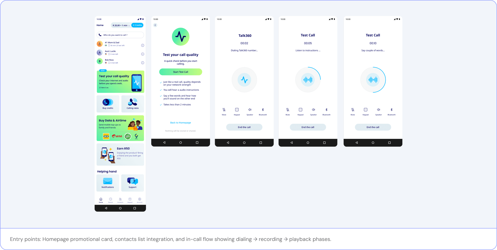
Designing across Product, Engineering, Data, and Support.
The feature depended on close alignment. The design was not only a set of screens, it was a shared system of user states, quality logic, copy behavior, and measurement requirements.

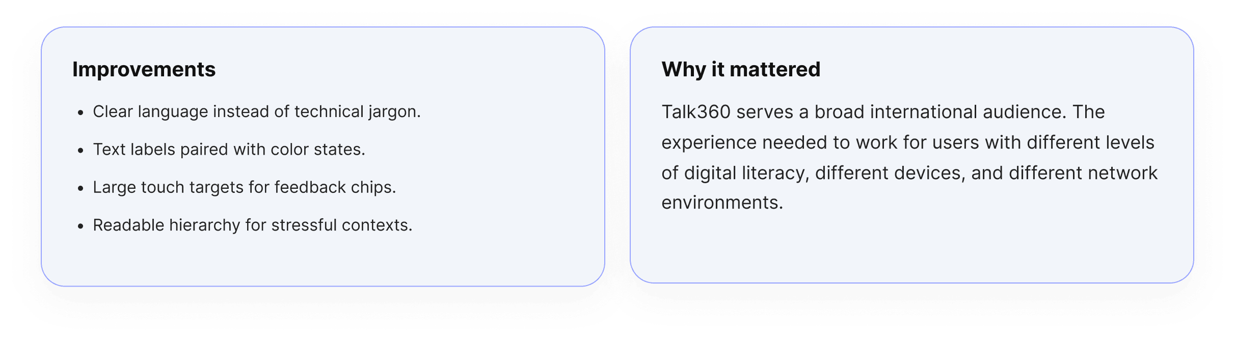
Accessibility.
Making quality understandable for more people.
What we intentionally left for V2.
A big part of this project was knowing what not to build yet. Future versions could add smarter diagnosis, but only when the system can support those claims reliably.

When a Talk360 user runs a test call for the first time, they are not just checking their
network. They are deciding whether to trust the app with something that matters: a
call to a parent, a partner, a child living across a border.
What we designed is not a technical tool. It is a handshake. Honest. It says: here is
what your connection looks like, here is what you can expect, here is what you might
want to fix. Then it gets out of the way and lets the call happen.
That, in the end, is what good product design is for.