

CLIENT:
DIGINEXT
YEAR
Jan 2024 - Sep 2024
ROLE:
PRODUCT DESIGNER

Story.

Business Problem.
A rocket with no launch pad
Diginext carries a bold ambition: connect Iran’s top startups with investors, mentors, and talent. Walking through the Tehran office, that energy was real. Walls covered in logos. Engineers at whiteboards. Investors moving fast.
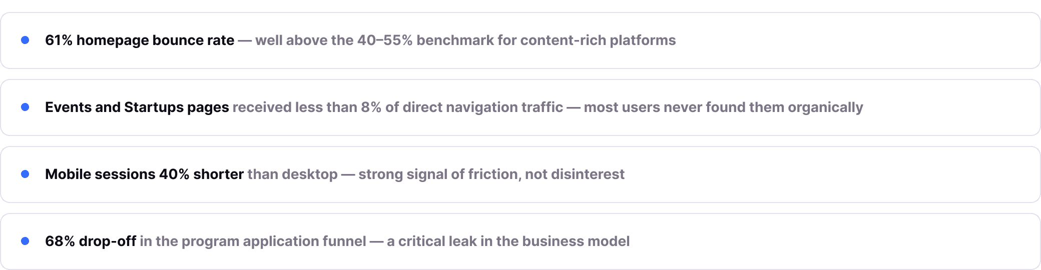
But the digital platform told a different story. 200,000 monthly users were arriving to find events, programs, mentors, and funding, and leaving frustrated. Not because the content was missing. Because the platform hid its value too well.
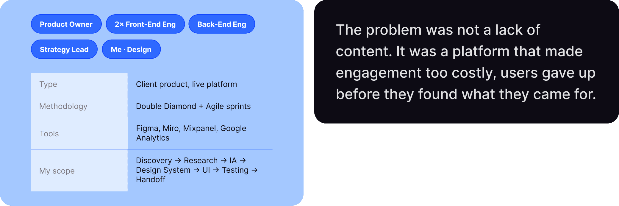
Research.
I refused to open Figma in week one.
Too many redesigns start with aesthetics and end with the same problems underneath a
prettier coat of paint. This one started with data.
What the analytics were already telling us
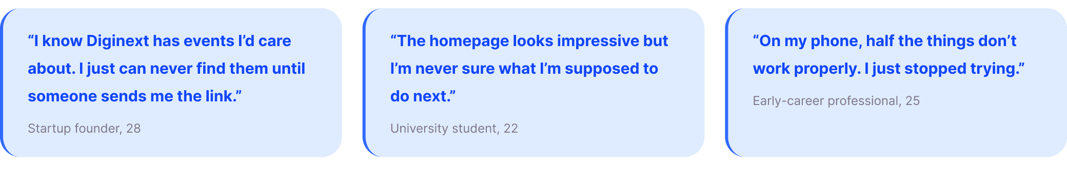
12 user interviews. 3 patterns that changed everything.
Final Design

Design System & IA.
Build the language before the screens
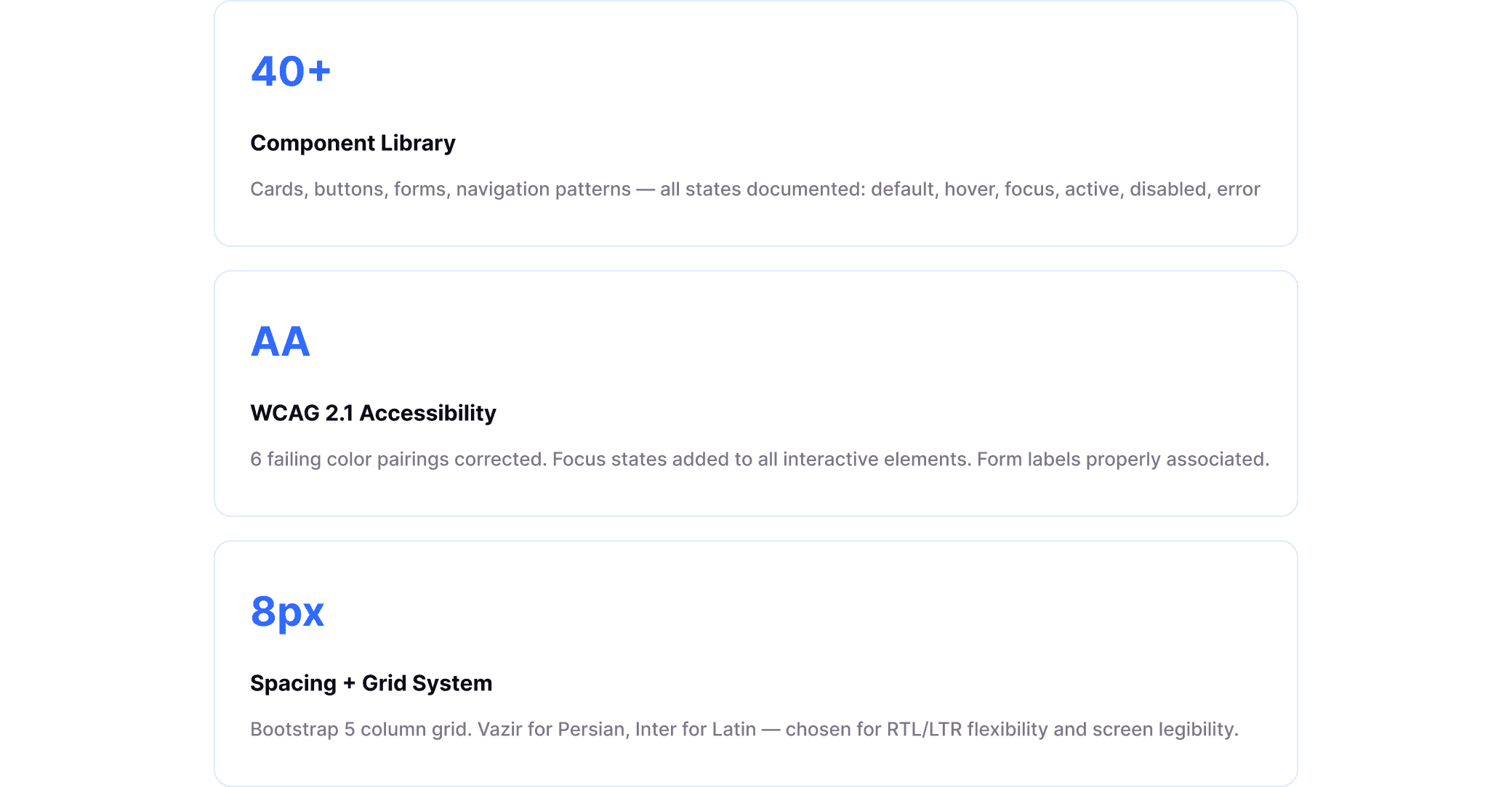
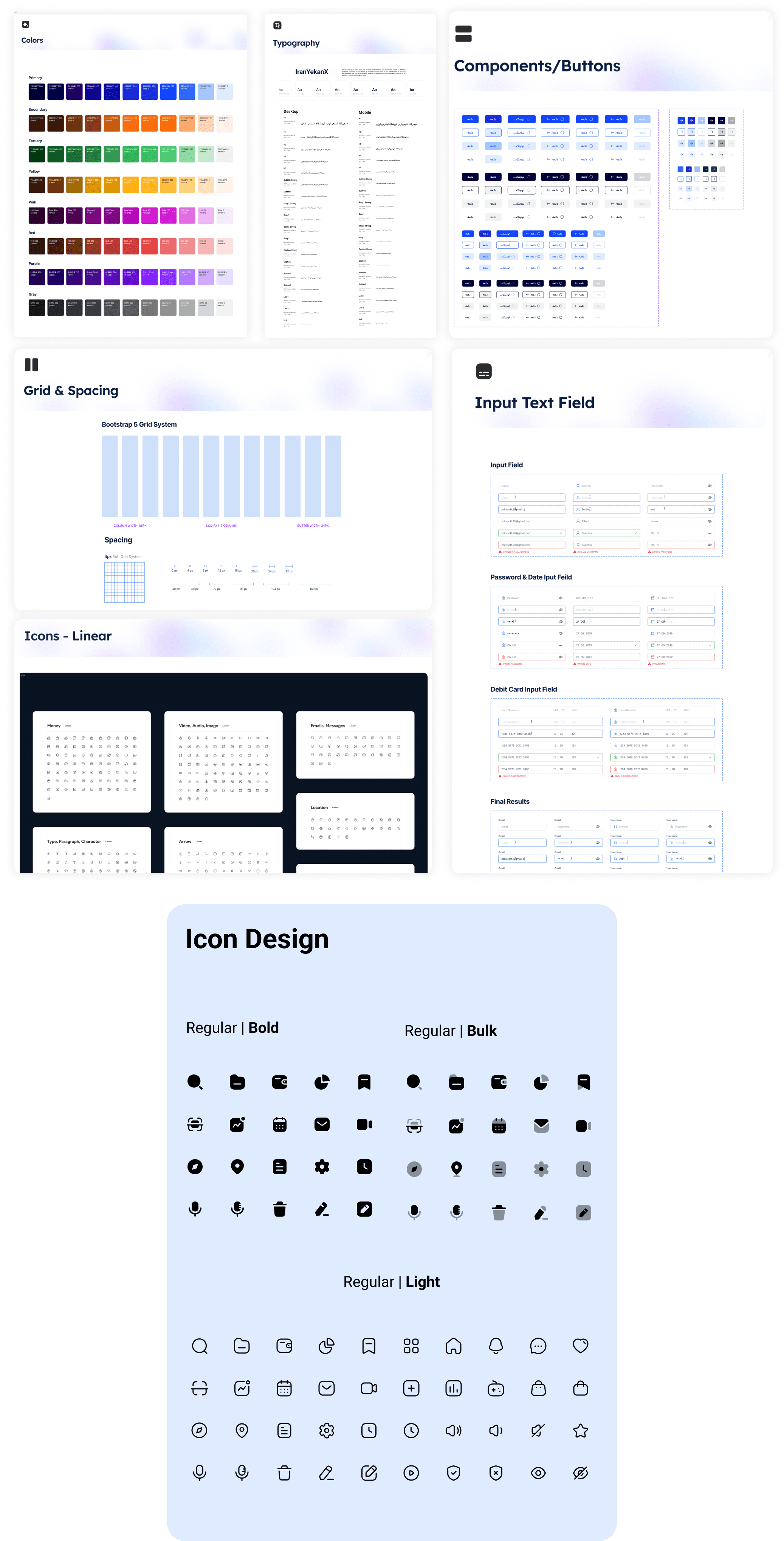
The first decision was to build the design system before any high-fidelity screen. It felt slower in week three. It saved weeks in week twelve.
Built in Figma with a bridge to Storybook. Engineers adopted it fully. By hand-off, there were almost no questions about spacing, color, or typography, the vocabulary was already shared.
From 11 nav items to 5
The navigation had eleven top-level items with no visible hierarchy. The Strategy Lead pushed back. I ran a card-sorting exercise with eight internal stakeholders. The data won the argument.
Iteration & Testing
Where the story gets interesting
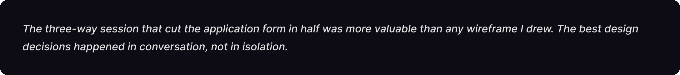
Good design is never finished on the first pass. The iterative phase is where the most important decisions happened, and where collaboration with engineering and product became genuinely creative.
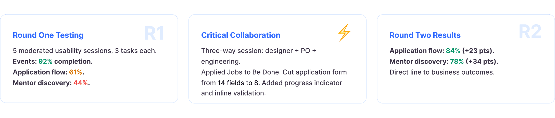
A/B testing at scale
Homepage hero: Variant A (static headline + single CTA) vs Variant B (rotating startup spotlight). Three weeks, tracked via Mixpanel. Variant A showed +14% click-through on the primary CTA. Launched A as default.
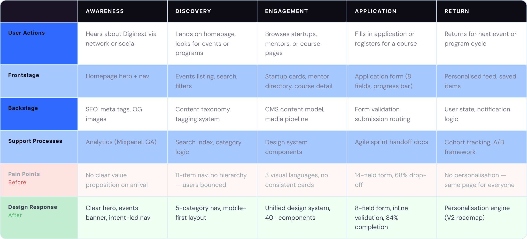
Service Blueprint
Mapping the full system
A service blueprint helped the team see beyond individual screens — aligning user-facing touchpoints with the backstage processes, data flows, and engineering dependencies that made them possible. It became the shared reference point between design, product, and engineering throughout delivery.
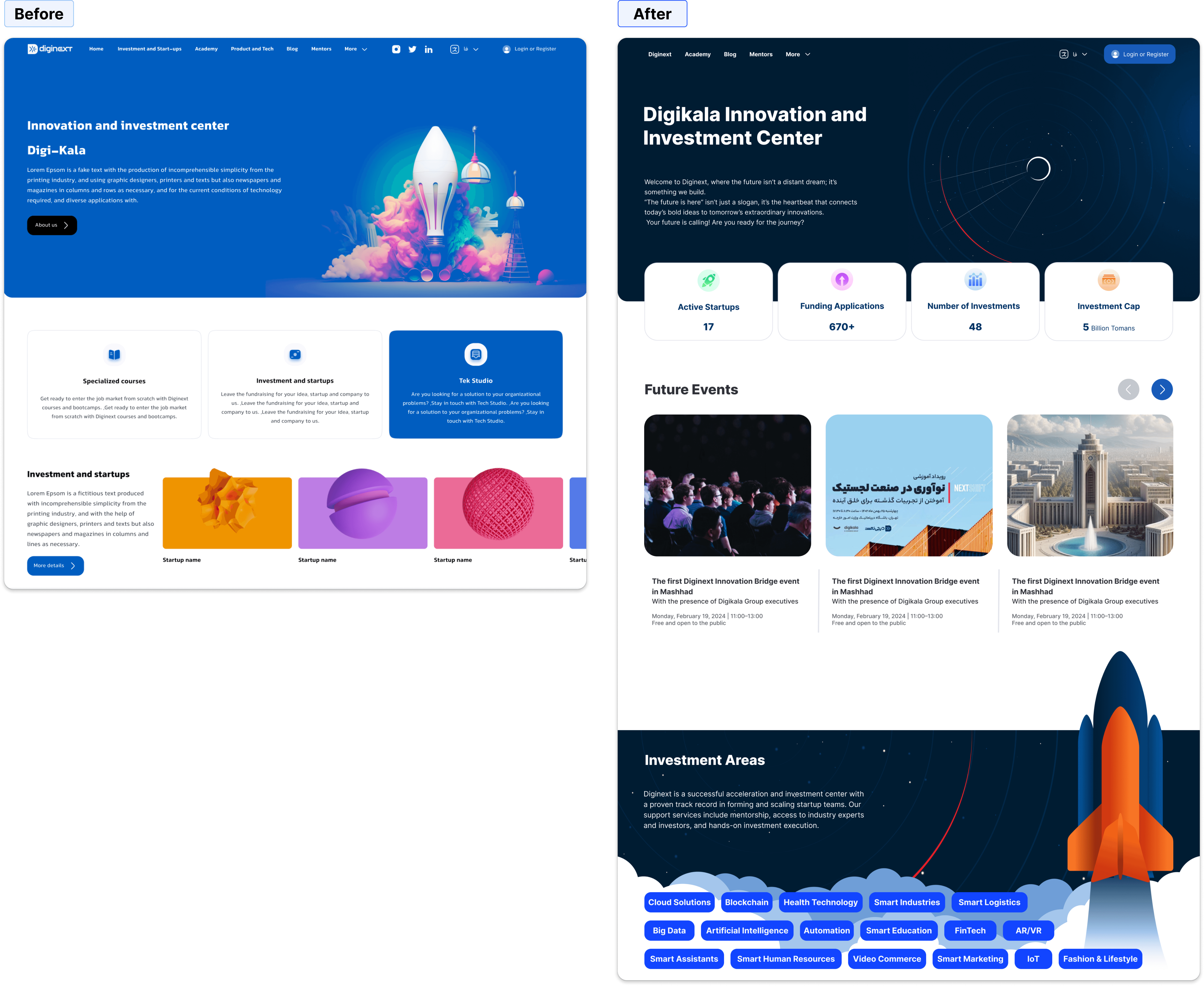
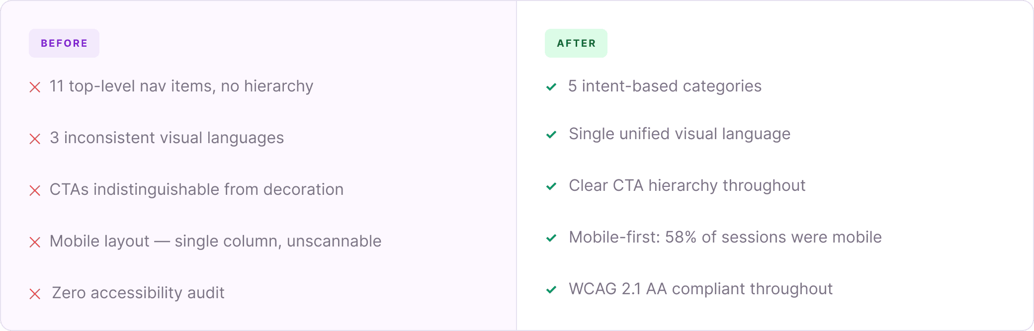
Before & After
Every row maps directly to a user pain point identified in research. These are not aesthetic preferences.
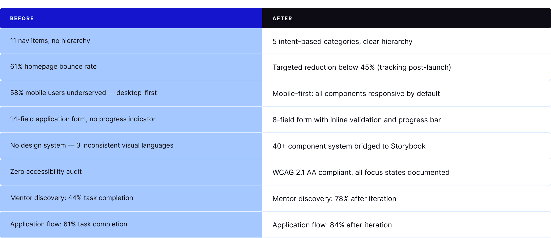
The most impactful work in this project was often the most invisible: restructuring a navigation, removing eight form fields, adding a focus ring.
I also learned something uncomfortable. My first mentor discovery design was wrong. A 44% completion rate told me so clearly. I rebuilt the section entirely between rounds, the result was 34 percentage points better.
The best thing you can do for your users is stay curious about why they struggle, and honest about when your first answer was not the right one.